

Take a look around the next time you’re in a public place.
People are checking their phones, searching for businesses, comparing products, reading reviews, looking up directions, and making purchases.
For many businesses, a smartphone may be one of the first places a potential customer encounters the company.
That’s why having a mobile-friendly website isn’t simply a nice feature anymore. It’s an important part of providing a good customer experience.
What Does “Mobile-Friendly” Mean?
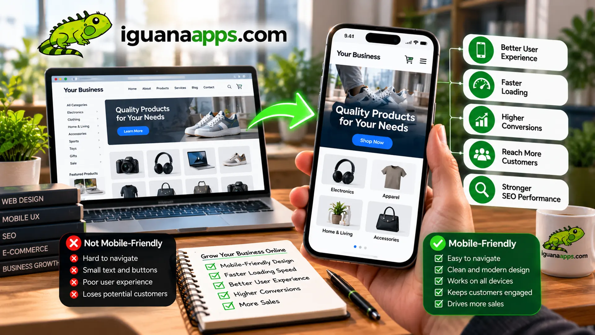
A mobile-friendly website is designed to work properly on smaller screens such as smartphones and tablets.
Visitors shouldn’t have to:
- Zoom in to read text
- Scroll sideways
- Struggle to tap buttons
- Wait excessively for pages to load
- Fight with difficult menus
- Fill out tiny forms
Instead, the website should automatically adapt to the device being used.
This is commonly accomplished through responsive web design.
- Customers Use Their Phones to Research Businesses
Before contacting a business, customers may search for:
- Products
- Services
- Prices
- Reviews
- Business hours
- Locations
- Directions
- Contact information
If your website provides a poor mobile experience, you may lose potential customers before they ever contact you.
- Mobile Users Expect Convenience
People generally don’t want to fight with a website.
If someone wants to call your business, the phone number should be easy to find and tap.
If they want directions, your address should be easy to locate.
If they want to request a quote, the form should be easy to complete.
A mobile-friendly website removes unnecessary obstacles.
- Responsive Design Makes Your Website Adapt
Responsive design allows a website’s layout to adjust based on the visitor’s screen size.
The same website can provide an appropriate experience on:
- Smartphones
- Tablets
- Laptops
- Desktop computers
Instead of building completely separate websites for every device, responsive design allows one website to adapt.
- Mobile-Friendly Doesn’t Mean “Smaller Desktop Website”
Simply shrinking a desktop website doesn’t necessarily create a good mobile experience.
Mobile design often requires different decisions.
For example:
- Navigation may become a menu button.
- Multiple columns may become a single column.
- Buttons may become larger.
- Images may be repositioned.
- Content may be reorganized.
The goal isn’t merely to make everything smaller.
The goal is to make everything easier to use.
- Forms Need Special Attention
Contact forms can be frustrating on mobile devices.
Make sure fields are:
- Large enough to tap
- Clearly labeled
- Easy to complete
- Limited to necessary information
If your business needs detailed information, consider whether the entire process can be simplified.
- Phone Calls Should Be Easy
For businesses that rely on phone calls, make your phone number highly visible.
On mobile devices, a visitor should ideally be able to tap the number and call without copying and pasting it.
This is a simple feature that can make a significant difference in usability.
- Your Website Should Load Efficiently
Mobile users aren’t always connected to fast Wi-Fi.
Large images, unnecessary scripts, and inefficient code can make a website frustrating to use.
Optimizing your website can improve the experience for visitors using different connections and devices.
- Test Your Website on Real Devices
Don’t assume your website works well on mobile simply because a browser window looks responsive.
Test it on actual devices whenever possible.
Check:
- Menus
- Buttons
- Forms
- Images
- Text
- Phone links
- Checkout
- Navigation
- Popups
Small problems can become very noticeable on a phone.
- Mobile-Friendly Design Benefits Your Entire Website
Designing for mobile can force businesses to prioritize what matters most.
That can result in:
- Cleaner layouts
- Better navigation
- Clearer messaging
- Faster pages
- More focused calls-to-action
These improvements can benefit desktop visitors too.
- Your Website Should Meet Customers Where They Are
Your customers don’t choose the device your website is viewed on.
They may discover your business from a phone while sitting at home, traveling, shopping, or looking for a service nearby.
Your website needs to be ready for them wherever they are.
Is Your Website Mobile-Friendly?
If your website is difficult to use on a smartphone, it may be time for an update.
Iguana Technologies builds responsive websites designed to provide a strong experience across modern devices.
Contact us at Iguana Technologies to find out how we can improve your business website.
Contact us
Get a FREE, NO OBLIGATION consultation appointment any time, by filling out the form below!
