

Your customers aren’t always sitting at a desktop computer when they search for your business.
They may be using a smartphone at home, at work, in a parking lot, or while traveling between locations.
For Utah businesses, having a website that works well on mobile devices is no longer something to treat as an optional upgrade.
Your website should be designed to provide a good experience regardless of how customers access it.
What Does Mobile-First Mean?
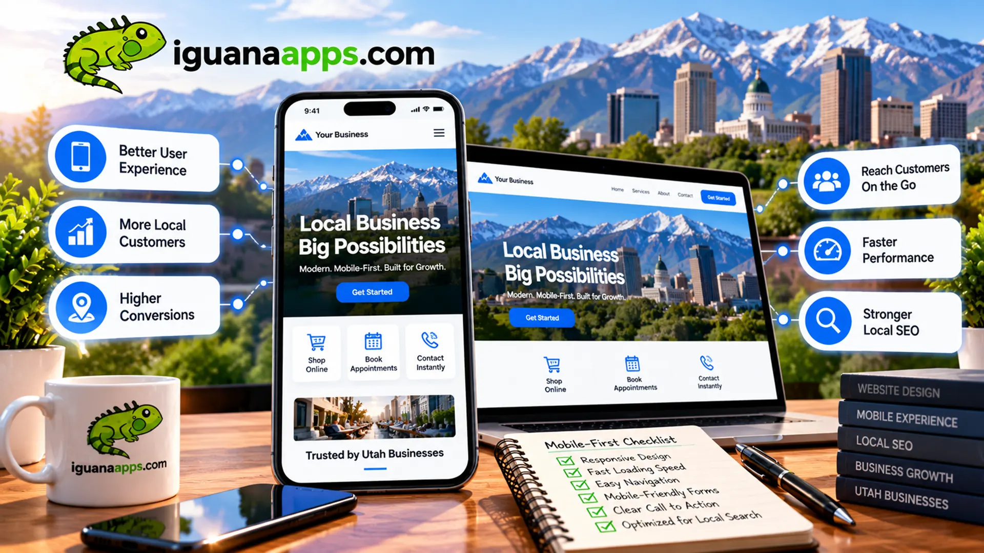
Mobile-first web design means considering the mobile experience as an important starting point in the design process.
Instead of creating a desktop website and simply shrinking it for smaller screens, developers consider how the site should work on mobile devices from the beginning.
This affects:
- Navigation
- Layout
- Typography
- Images
- Buttons
- Forms
- Performance
- Content organization
Why Mobile Matters for Local Businesses
Local customers often search for businesses while they’re away from their computers.
They may be looking for:
- A nearby restaurant
- A contractor
- A repair service
- A store
- A professional service
- An appointment
- A phone number
- Directions
If your website is difficult to use on a phone, you may lose the opportunity before the customer ever contacts you.
Make Your Phone Number Easy to Use
For businesses that rely on phone calls, this is particularly important.
Your phone number should be easy to find.
On mobile devices, it should be easy for customers to tap and call.
Don’t make someone search through your website to find your phone number.
Make Forms Mobile-Friendly
Long, complicated forms are difficult to complete on a smartphone.
Consider:
- Reducing unnecessary fields
- Using appropriate input types
- Making buttons large enough to tap
- Keeping labels clear
- Providing useful error messages
A simple form can make contacting your business much easier.
Navigation Should Be Simple
Mobile screens provide less space.
Your navigation should prioritize the pages customers are most likely to need.
Important options might include:
- Services
- Products
- About
- Contact
- Locations
- Appointments
Avoid overwhelming visitors with unnecessary navigation options.
Speed Matters
Mobile users may have varying connection speeds and device capabilities.
Your website should be optimized for performance.
Common improvements include:
- Compressing images
- Using modern image formats where appropriate
- Reducing unnecessary scripts
- Optimizing code
- Improving caching
- Choosing appropriate hosting
A faster website provides a better experience.
Make Buttons Easy to Tap
Tiny buttons are frustrating on smartphones.
Important actions should be visually clear and easy to interact with.
This is particularly important for:
- Contact buttons
- Appointment buttons
- Add-to-cart buttons
- Navigation
- Checkout
Content Still Matters
Mobile-first doesn’t mean removing important information.
Instead, organize information so that visitors can find what they need efficiently.
Use:
- Short paragraphs
- Clear headings
- Lists
- Descriptive buttons
- Logical page structures
Make your content easy to scan.
Test Your Website on Real Devices
A website that looks good in a desktop browser doesn’t necessarily provide a good mobile experience.
Test different screen sizes and devices.
Pay attention to:
- Navigation
- Forms
- Images
- Buttons
- Page speed
- Text readability
- Checkout
- Contact information
Real-world testing can reveal problems that aren’t obvious during development.
Mobile and Local Search Work Together
For many local businesses, mobile visitors are particularly valuable because they’re often looking for something nearby or something they can contact immediately.
Your mobile website should make those actions easy.
For example:
Find a location.
Call the business.
Get directions.
Request an appointment.
Ask for a quote.
The shorter the path to the desired action, the better the experience can be.
Your Website Should Work Wherever Your Customers Are
A modern business website needs to work across devices and situations.
At Iguana Technologies, we build responsive, mobile-friendly websites for businesses that want a professional online presence and a better customer experience.
We can help with everything from a new business website to e-commerce, custom applications, integrations, and website redesigns.
If your Utah business website isn’t providing a great mobile experience, contact us at Iguana Technologies to discuss an upgrade.
Contact us
Get a FREE, NO OBLIGATION consultation appointment any time, by filling out the form below!
