

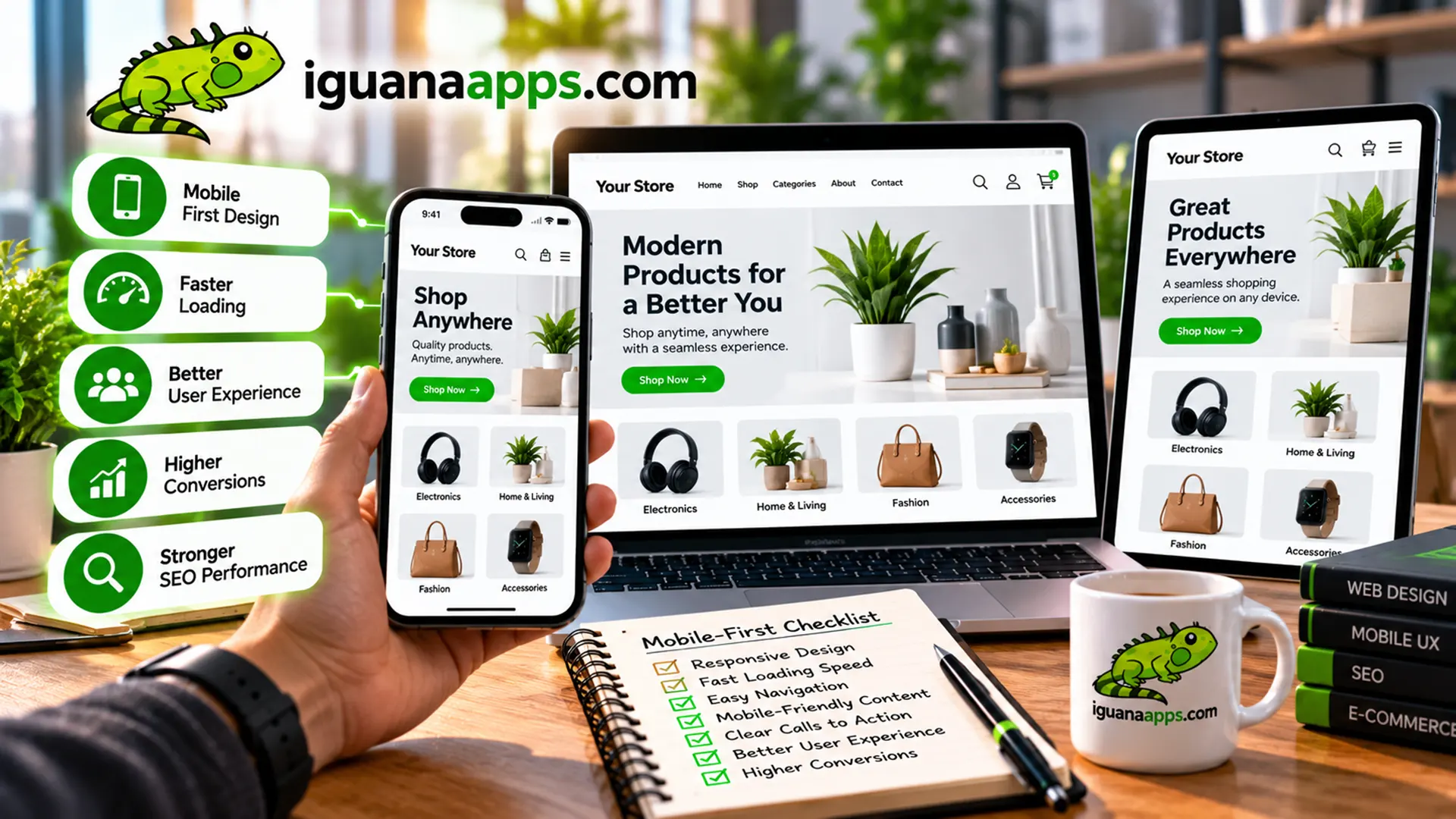
For years, businesses often designed websites primarily for desktop computers and then adapted them for smartphones.
Today, many businesses are taking the opposite approach.
Instead of starting with a large desktop screen, mobile-first web design starts by considering the smallest common screen and the essential experience first.
This approach can help businesses create websites that are simpler, faster, and easier to use.
What Is Mobile-First Web Design?
Mobile-first design means designing the website experience for mobile devices before expanding the layout for larger screens.
The process encourages designers and developers to ask:
What does the customer actually need on a small screen?
Once those essentials are established, additional content and features can be added for larger devices.
Mobile-First Isn’t the Same as Mobile-Only
A mobile-first website isn’t designed exclusively for smartphones.
It’s still designed to work on:
- Smartphones
- Tablets
- Laptops
- Desktop computers
- Large displays
Mobile is simply the starting point.
The website then expands and adapts as more screen space becomes available.
- Mobile-First Forces Businesses to Prioritize
Desktop screens provide a lot of space.
That can make it tempting to add everything.
Mobile screens force businesses to ask what actually matters.
This can result in clearer:
- Headlines
- Navigation
- Calls-to-action
- Forms
- Product information
- Service descriptions
The result can benefit customers on every device.
- It Can Lead to Cleaner Designs
A mobile-first approach naturally encourages simplicity.
Instead of filling a page with unnecessary elements, designers can focus on the content that customers actually need.
That can make the website easier to understand.
- Important Actions Become More Obvious
Consider a service business.
A mobile visitor may primarily want to:
- Call
- Request a quote
- Book an appointment
- Find the address
- View services
Mobile-first design encourages businesses to make these actions prominent.
- Navigation Needs Special Attention
Large desktop navigation bars don’t always translate well to mobile.
Mobile websites often use compact navigation systems.
The important thing is that visitors can quickly understand how to find the information they need.
- Buttons Need to Be Designed for Touch
Desktop users typically use a mouse.
Mobile users use their fingers.
That means interactive elements need to be appropriately sized and spaced.
Buttons that are easy to click with a mouse may be frustrating to use on a touchscreen.
- Content Should Be Easy to Scan
People often scan websites rather than reading every word.
Mobile-first design encourages:
- Shorter paragraphs
- Clear headings
- Bullet points
- Strong visual hierarchy
- Important information near the top
This can improve readability across devices.
- Performance Becomes More Important
Mobile-first design often encourages developers to think carefully about what needs to load.
That can mean reducing unnecessary assets and optimizing images and scripts.
A simpler website can often provide a better experience.
- Mobile-First Can Improve the Desktop Experience Too
One of the biggest benefits of mobile-first thinking is that it doesn’t have to produce a worse desktop website.
Instead, it can help businesses eliminate unnecessary complexity.
Once the essential experience is strong, designers can use the additional desktop space to provide useful functionality rather than simply filling empty space.
- Mobile-First Works Well for Local Businesses
Local businesses often receive visitors who are searching for information while they’re away from a desktop computer.
For example, someone might search for a restaurant, contractor, repair service, retailer, or professional service from their phone.
That visitor may need an answer immediately.
A mobile-first website should make that information easy to find.
- Think About the Customer’s Goal
Mobile-first isn’t ultimately about technology.
It’s about customers.
Ask:
Why did this person come to our website?
If you can answer that question, you can prioritize the content and features that matter most.
Is Mobile-First Right for Your Business?
For most modern business websites, designing with mobile users in mind is an important consideration.
However, every website is different.
The right design should be based on your audience, industry, content, functionality, and business goals.
Build a Website Designed for Today’s Customers
Iguana Technologies creates responsive and mobile-focused websites for businesses that want a stronger online presence.
If your website was built primarily for desktop computers and hasn’t been updated in years, we can help modernize it.
Contact us at Iguana Technologies to discuss your next website project.
Contact us
Get a FREE, NO OBLIGATION consultation appointment any time, by filling out the form below!
